Digital Transformation of FOTOGALERIE Friedrichshain
Lead UX/UI & Sonic Designer | Berlin, Germany | 2026
1. Project Overview
Client: Fotogalerie Friedrichshain – A first photography gallery in Berin serving Berlin and international audiences.
Problem:
The existing website functioned as a static archive with:
Confusing navigation and information hierarchy
Poor mobile responsiveness
Lack of e-commerce capabilities for prints and products
Low engagement and high bounce rate
Mission:
Redesign the digital experience to:
Modernize the visual identity and UI
Improve user engagement for local and international audiences
Introduce e-commerce capabilities for gallery products
Ensure legal compliance (GDPR, Impressum) and accessibility
Projected Impact:
30% rise in international print sales
Higher retention and engagement through immersive UX
2. Old Website Audit (The "Before")
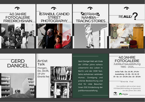
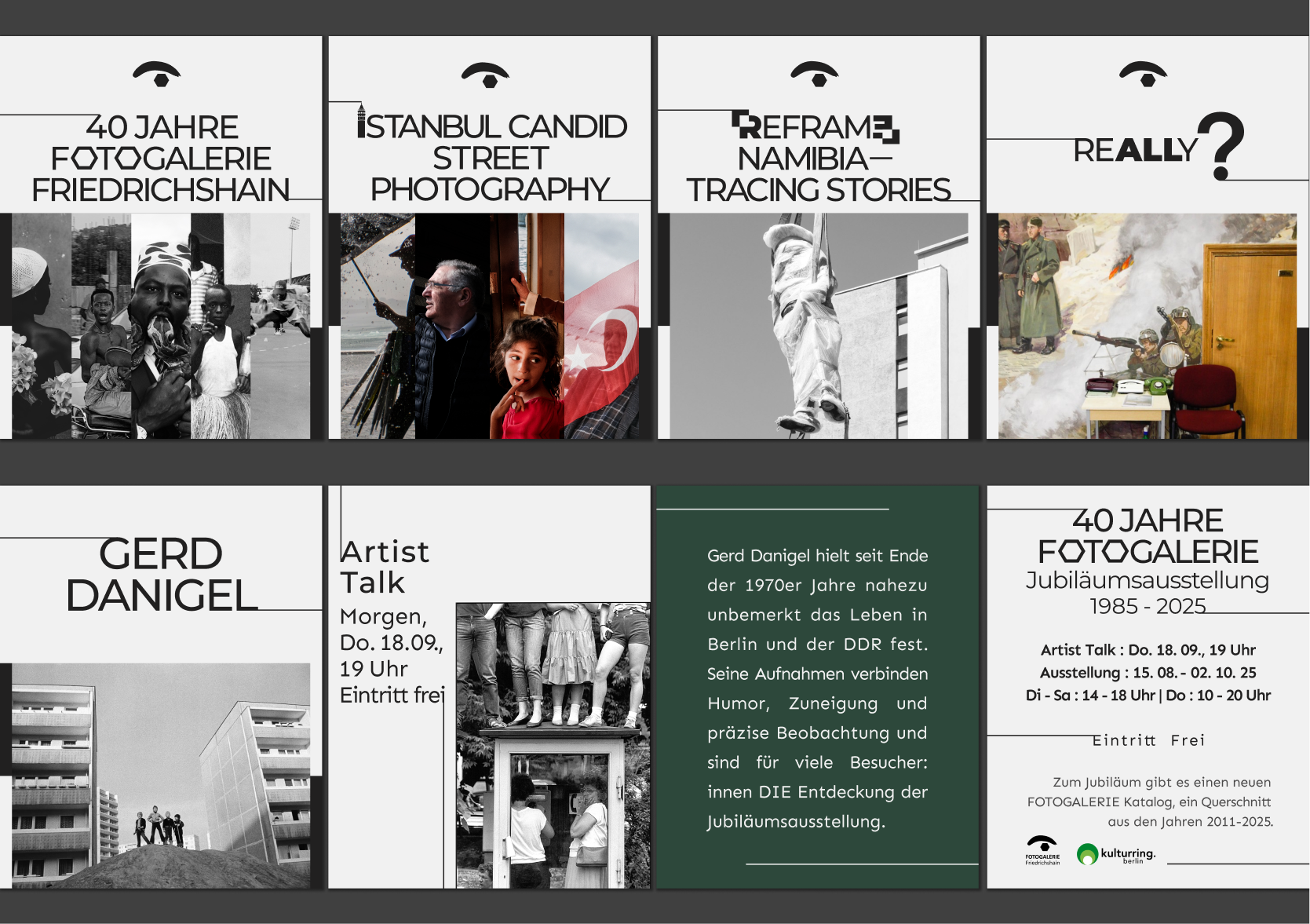
2.1 Annotated Screenshots
(Include screenshots of Homepage, Exhibition Page, Artist Page, Shop with red markers highlighting UX problems.)
2.2 Heuristic Evaluation Table
| UX Area | Critical Friction Point | Business/User Impact |
|---|---|---|
| Visual Design | Dark, heavy layout; small low-res images | Undermines perceived value of photography; low engagement |
| Navigation & IA | Over-nested menus; exhibitions hard to find | Frustrates international visitors seeking quick info |
| Content Presentation | Long text blocks; insufficient image emphasis | Low scan-ability; key info buried |
| Interactivity | No CTA or online ticketing | Missed conversion opportunities for visitors and collectors |
| Responsive Design | Subpar mobile experience | Mobile users struggle to access content |
| Brand Consistency | Style inconsistent with gallery identity | Weak brand presence and trust |
Insight: The website fails to communicate the gallery’s artistic identity, guide users effectively, or support revenue-generating actions.
3. User Flows
Exhibition Visitor Flow:Homepage → Exhibitions List → Exhibition Detail → Book Tickets → Confirmation
Shop Purchase Flow:Homepage → Shop → Product Detail → Add to Cart → Checkout → Payment → Confirmation
Artist Exploration Flow:Exhibition Page → Click Artist → Artist Profile → Explore Past Collaborations → Related Exhibitions
4. User Journey Map Example: "The Berlin Art Seeker"
| Stage | Actions | Emotions | UX Opportunities |
|---|---|---|---|
| Awareness | Lands on Homepage | Curious | Highlight featured exhibition hero image with CTA |
| Exploration | Browses current exhibition | Inspired | Card layout with clear categories, mobile-friendly |
| Engagement | Views artwork + artist profile | Engaged | Lightbox with high-res images, artist bio, optional audio narration |
| Conversion | Books tickets / Purchases print | Confident | Clear CTA buttons, frictionless checkout, international shipping info |
| Reflection | Post-visit | Satisfied | Follow-up newsletter or social media share prompts |
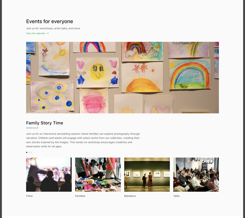
Optional Sonic UX Integration:
Ambient gallery sounds or artist voice snippets to enhance immersion.
Earcons for interactions to reinforce tactile feedback digitally.
Persona
Personas were created to inform information architecture, content hierarchy, and conversion flows — not as standalone artifacts.
Persona 1 — Primary
The International Art Visitor
Profile
International visitor / expat / tourist
Visits Berlin for culture
Mobile-first
Goals
Discover current exhibitions quickly
Understand context without deep local knowledge
Book tickets or buy a print easily
Pain Points
Hard to tell what’s “on now”
Too much text, not enough visual cues
Friction in buying or booking from abroad
Design Impact
Clear “Current Exhibitions” entry point
Visual-first homepage
Prominent CTAs
English-first clarity + international checkout
Persona 2 — Secondary (Optional but smart)
The Local Art Supporter / Collector
Profile
Berlin-based
Regular gallery visitor
Interested in prints, books, membership
Goals
Follow gallery program
Support the institution
Buy limited editions
Pain Points
Hard to browse archive
No clear shop structure
No incentive to return
Design Impact
Artist archive
Shop filters by artist
Membership / support section
Newsletter + return hooks
5. UI Redesign Strategy
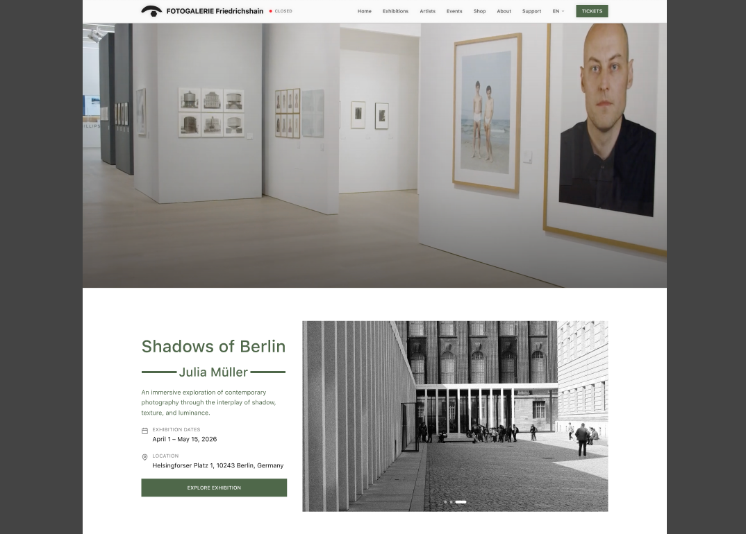
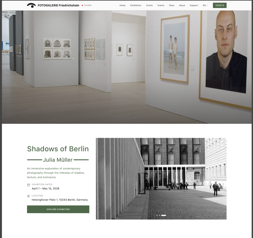
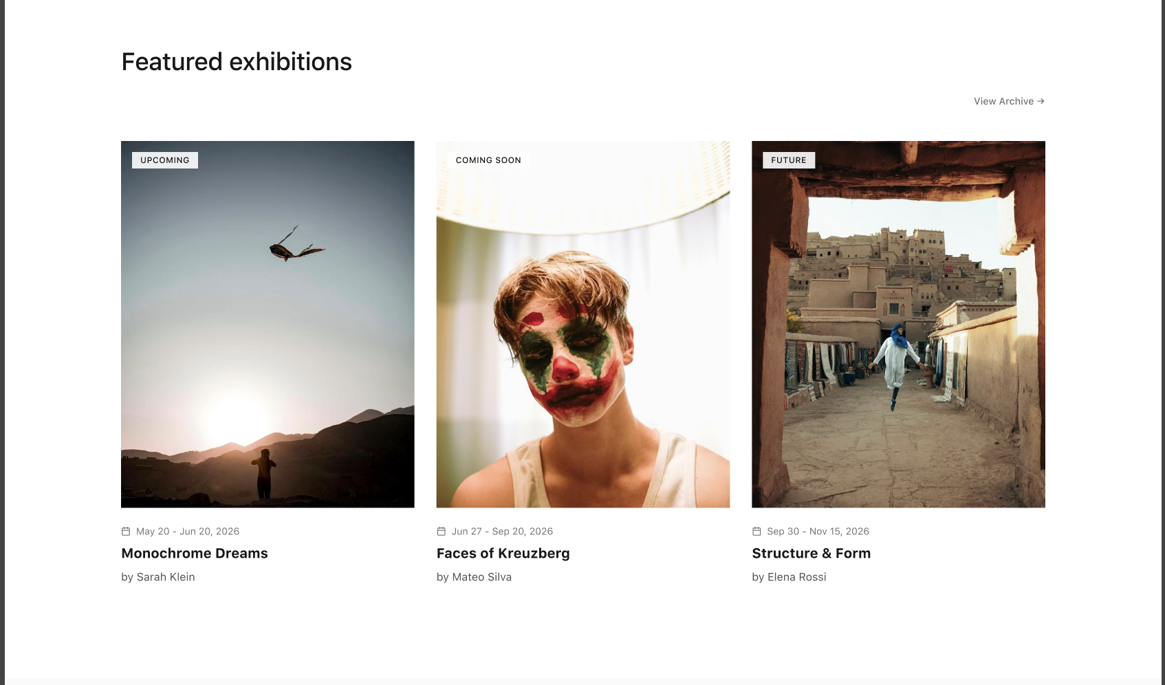
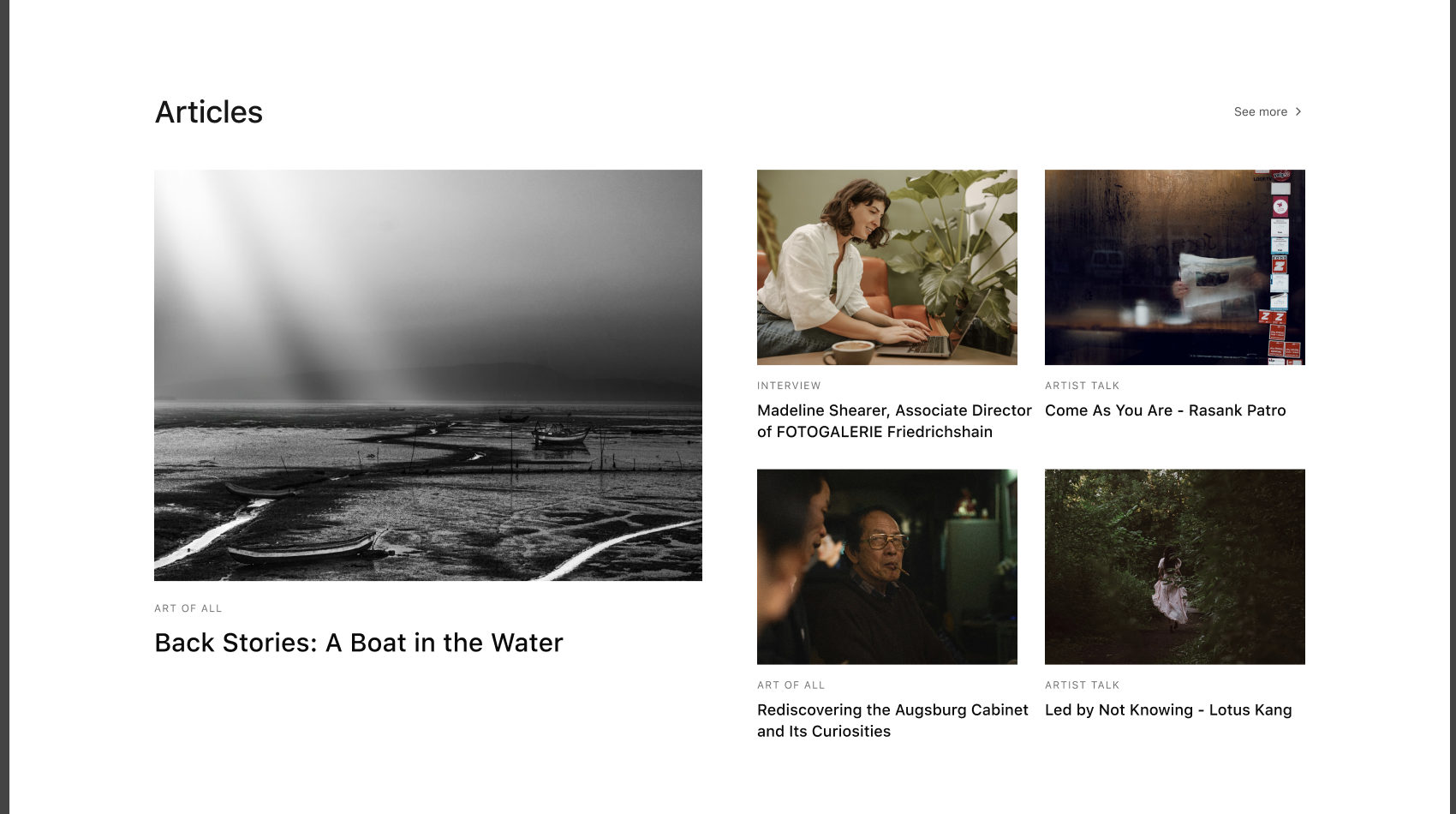
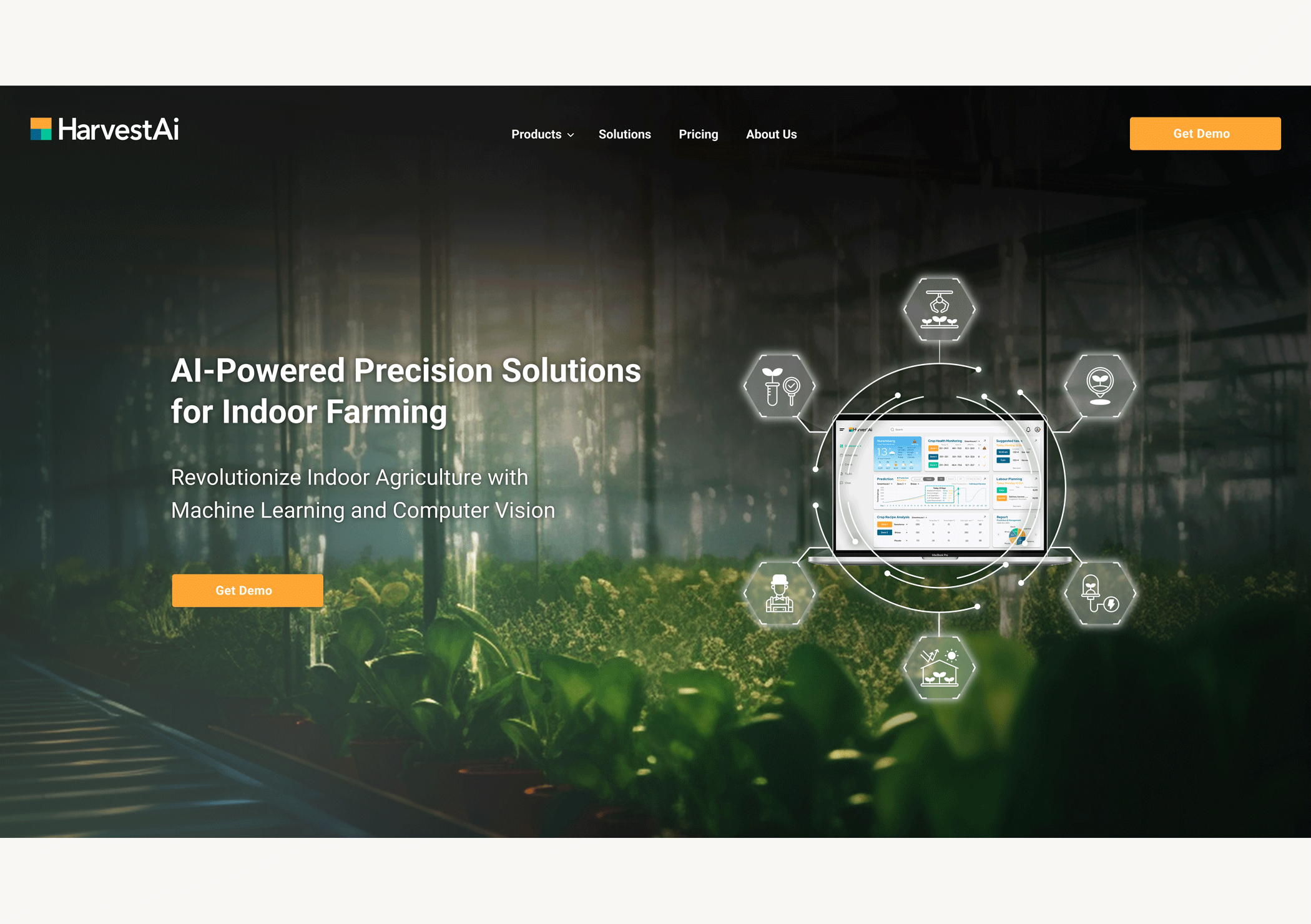
5.1 Homepage: Bold Minimalism
Large hero banner showcasing current exhibition with prominent CTA (“Book Now”).
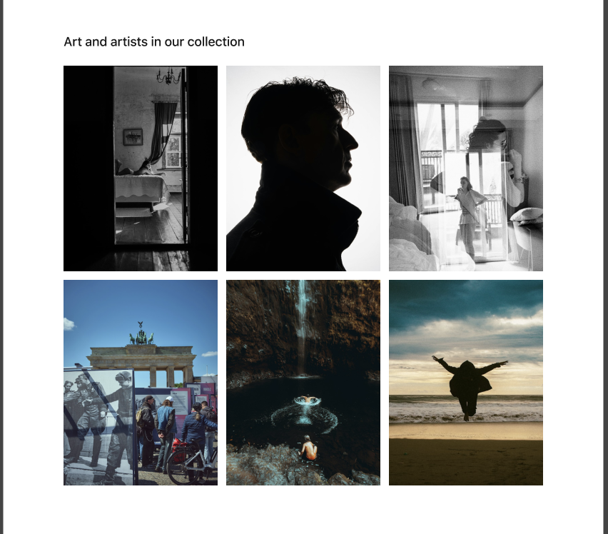
Featured exhibitions in card grid format.
Highlights from Shop: prints or photobooks.
Newsletter subscription CTA.
Persistent “Open/Closed” indicator in header.
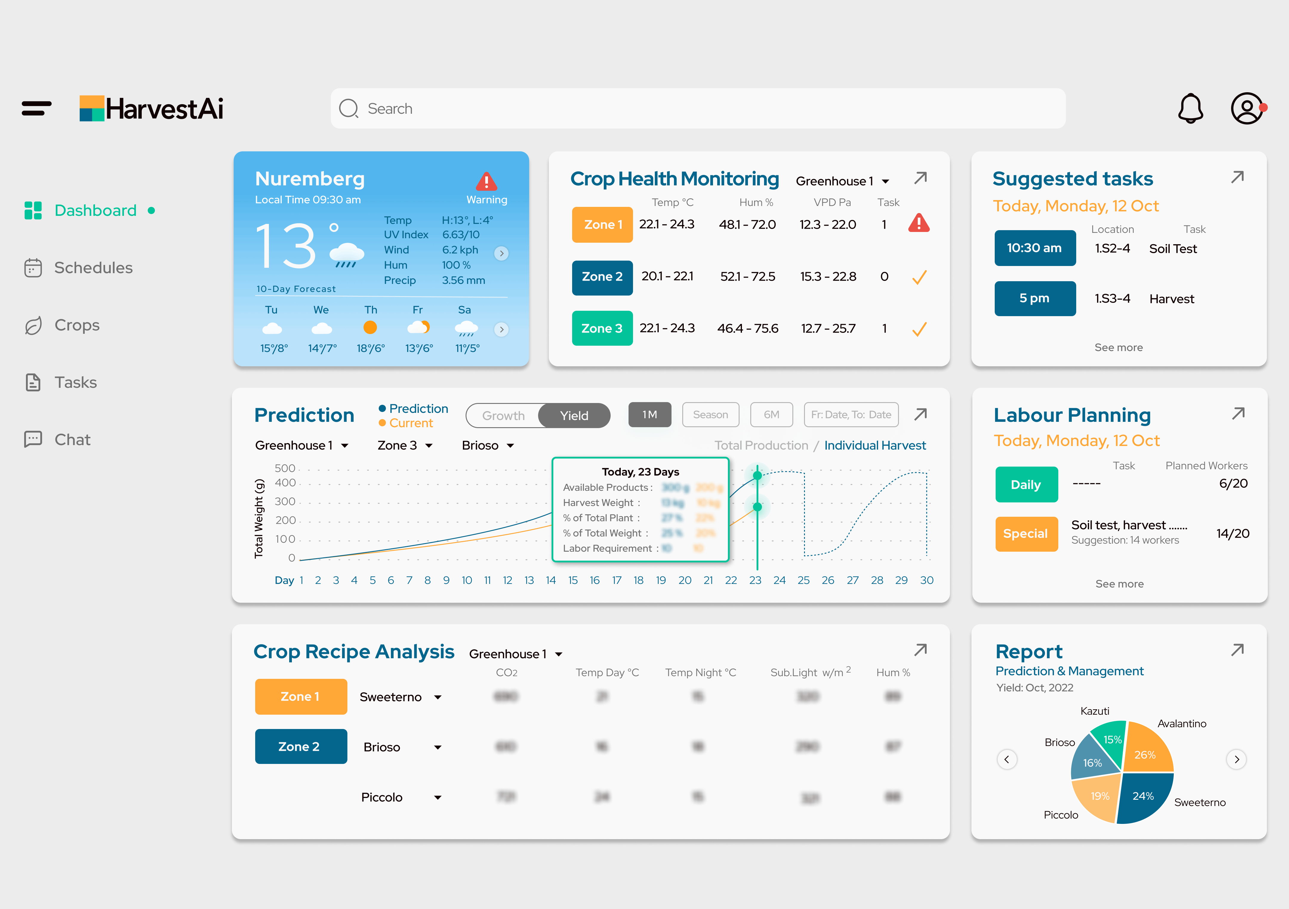
5.2 Exhibition Page: Digital Walkthrough
Horizontal parallax scrolling to simulate gallery movement.
High-res images with Lightbox modal.
Brief artist bios with links to full Artist Page.
Ticket booking CTA and related exhibitions suggestion.
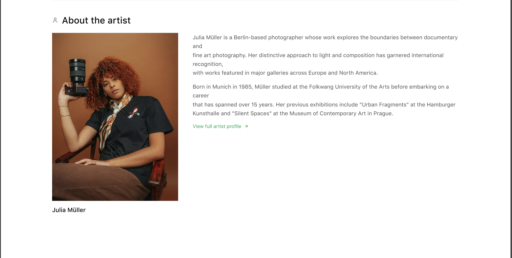
5.3 Artist Page: Active & Archive
Active artists: current collaborators, exhibition participation.
Archive: past artists and historical collaborations.
Artwork gallery, biography, past exhibitions list.
Cross-links to related exhibitions and shop products.
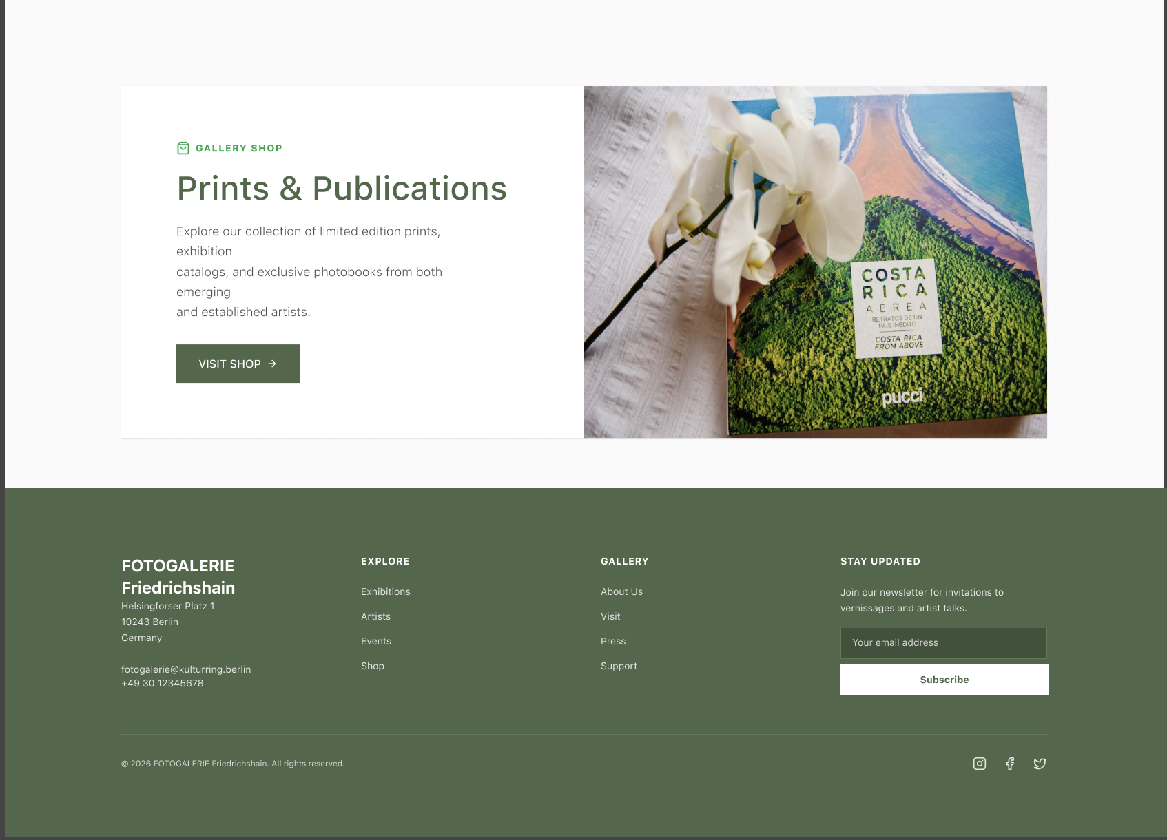
5.4 Shop Page: Content-to-Commerce
Filtering by Artist, Category, or Movement.
High-quality product images and descriptions.
Clear checkout flow with international shipping support.
Trust signals: GDPR, Impressum, secure payment methods.
6. Old vs New Design Comparison
| Feature | Old Website | Redesigned Website |
|---|---|---|
| Homepage Hero | Small, static image | Large, dynamic banner with CTA |
| Navigation | Nested menus; confusing | Clear top-level menu + sticky header |
| Exhibition Listing | Text-heavy | Card-based grid, high-res images |
| Artist Info | Minimal | Full Artist Page with current & archive artists |
| Shop | Email-based inquiries | Integrated e-commerce with filters & checkout |
| Mobile UX | Poor | Fully responsive, mobile-first design |
7. Legal & Compliance (German Market)
Impressum: Accessible within two clicks.
GDPR / DSGVO: Active consent banners; options for Reject/Accept equally prominent.
Accessibility: WCAG 2.1 Level AA compliance; alt text and audio descriptions for visually impaired users.
Key Takeaways
- Clear separation between “Current Program” and “Archive” is critical
Cultural institutions fail when everything looks historical. Prioritizing “what’s on now” directly supports attendance and engagement. - Visual hierarchy drives trust in art contexts
High-resolution imagery and restrained UI increased perceived value more than adding content or features. - E-commerce must feel contextual, not commercial
Integrating shop entry points within exhibitions and artist pages reduced friction without diluting the cultural brand. - International users expose UX debt faster than locals
Language clarity, checkout transparency, and navigation simplicity were non-negotiable for a Berlin-based gallery with global reach. - Legal and accessibility compliance is a design constraint, not an afterthought
Designing with GDPR, Impressum, and WCAG in mind improved clarity and reduced interface noise.


