Data AI-Web, Mobile, LinkedIn Ad and Brochure Cover
Core Message
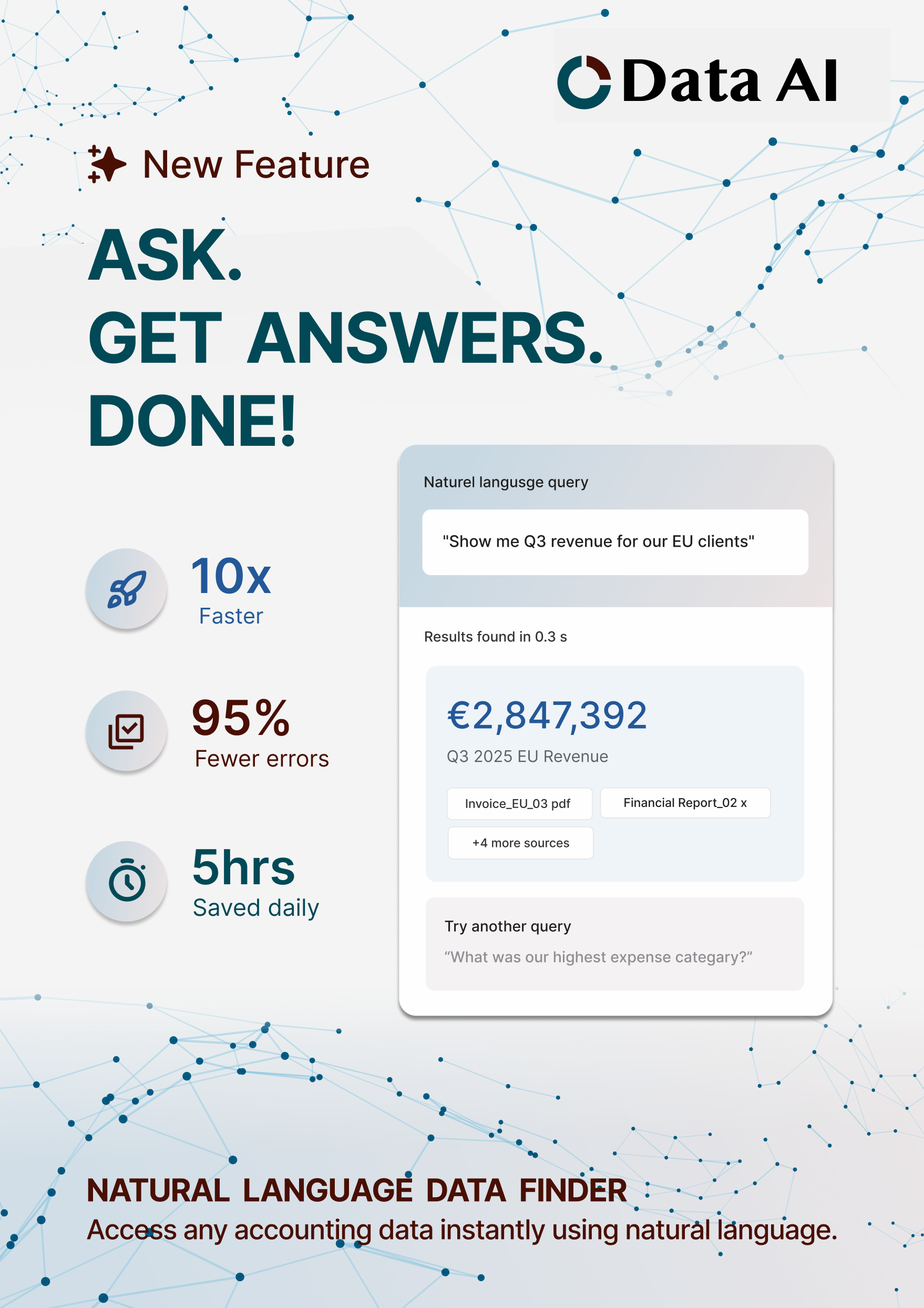
“ASK. GET ANSWERS. DONE!”
It reframes the feature in plain language. No buzzwords. No over-selling.
Positioning
Accountants don’t want “innovation.” They want certainty, speed, and audit-safe
accuracy.
This feature gives them:
• Faster access to answers
• Less manual lookup
• Clear document references
No inflated metrics. The value is obvious without forcing numbers.
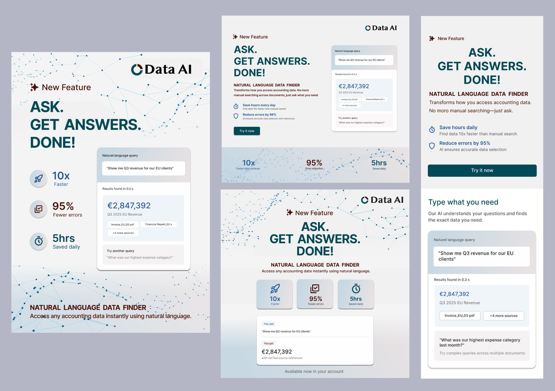
Web
- Headline: Clear, short, immediate.
- One sentence value: What changes and why it matters.
- Real UI demo: User types a query → system returns the answer with the
source documents. - Three benefits:
- Speed
- Accuracy
- Verified references - Primary CTA: “See how it works.”
Design notes:
• A controlled gradient helps break the section visually without making it look
like “AI fireworks.”
• Real interface, not stylized mockups. Accounting users trust screenshots.
• Icons are minimal and functional, no cartoon drama.
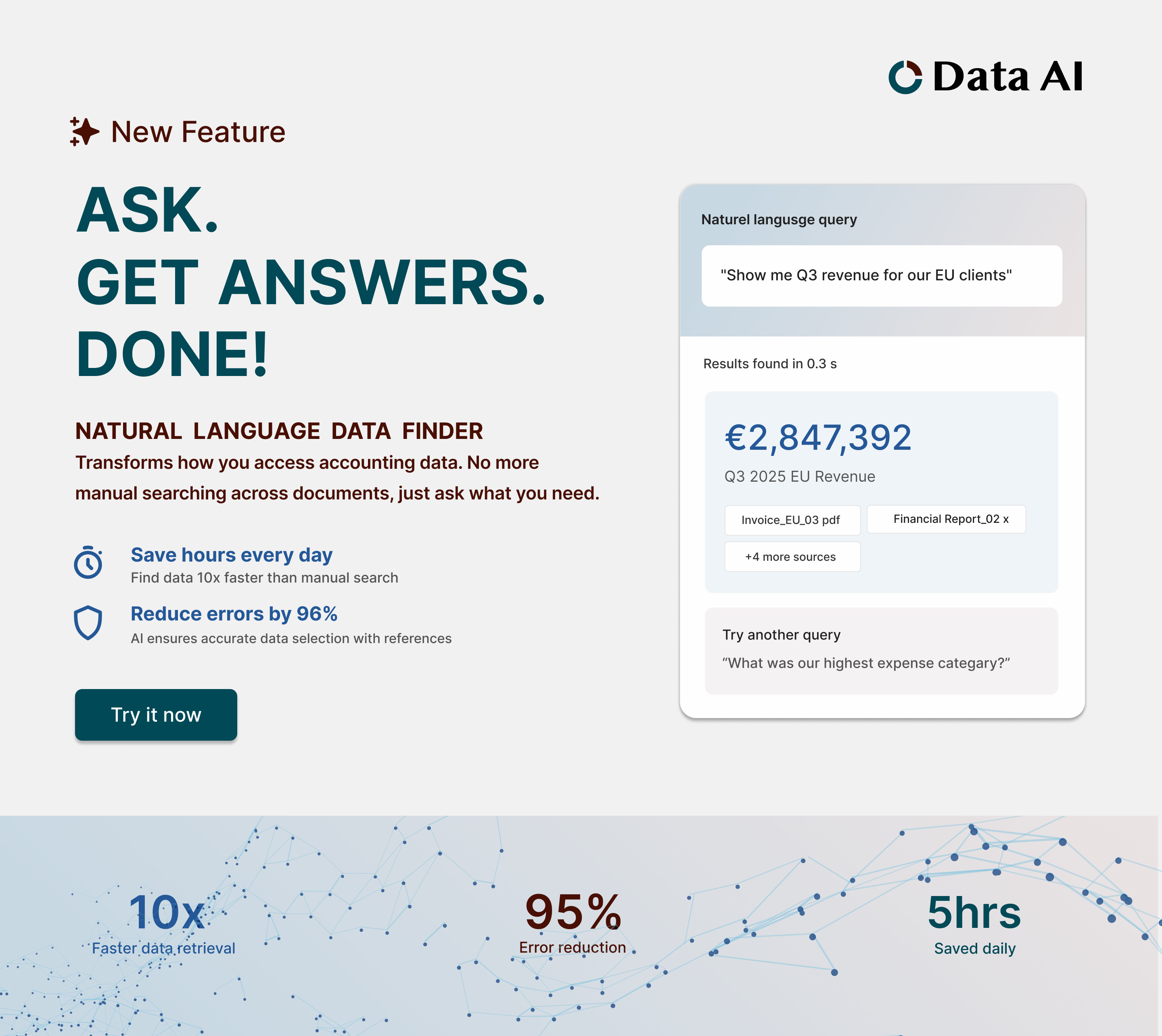
Mobile
• Stack everything: headline → demo → CTA → benefits.
• No decorative space. Mobile users skim.
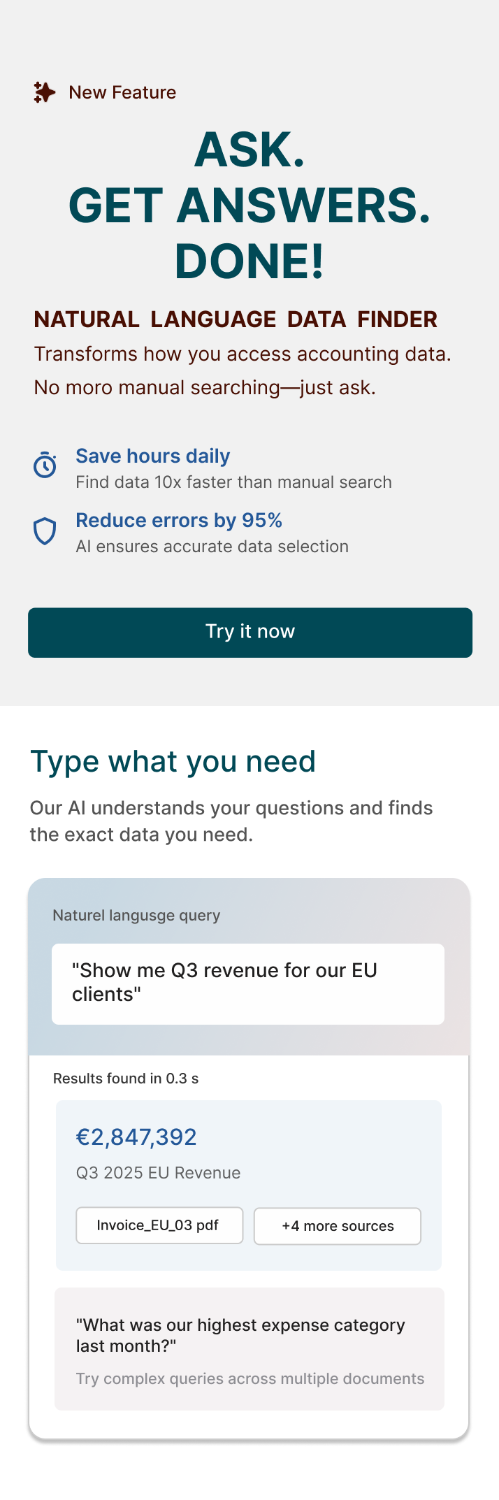
LinkedIn Ad
Goal: Tell a full story in 2 seconds.
Layout:
• Large headline: “ASK. GET ANSWERS. DONE!”
• Query card: "Show me Q3 revenue for EU clients"
• Result card beneath with clean references.
• Small line: “Available now in your account.”
No stats. No paragraphs. No clutter.
Warm leads don’t need education; they need to know it’s available.
Brochure Cover
Conference reality: People grab things quickly and decide in 1–2 seconds if it’s
worth reading.
Design:
• White background for clarity under bad lighting.
• Single gradient card showing a query + result.
• Headline: “ASK. GET ANSWERS. DONE!”
• Three icons (speed, accuracy, audit trail).
• Booth footer with minimal noise.
This looks premium and reads fast
Color Direction
Deep Teal
Use: Primary base / backgrounds / headers
Reasoning:
• Conveys trust, stability, and professionalism, critical for accounting SaaS
aimed at global enterprise clients.
• Dark enough to anchor your layout without feeling heavy.
• Works well with white text or light UI elements for clarity and contrast.
Burgundy
Use: Accent / highlights / calls-to-action / key visual elements
Reasoning:
• Signals confidence, seriousness, and premium quality.
• Provides warmth and contrast against cooler tones, giving the interface depth
without feeling playful.
• Draws attention selectively, e.g., buttons, icons, or data highlights, without
overwhelming the design.
Dark Blue
Use: Secondary highlights / interactive elements / info states
Reasoning:
• Communicates innovation, clarity, and reliability, balances seriousness
with approachability.
• Ideal for links, hover states, or any elements where you want users to feel
guided and confident.
• Complements both the deep teal and burgundy without clashing.
Overall Palette Logic
• Trust + Innovation: Teal + Indigo
• Premium + Attention: Burgundy accents
• Professional + Readable: All three work harmoniously with white/neutral
backgrounds.
• Global/enterprise-friendly: Works across Latam, US, EU audiences without
cultural misinterpretation.
This palette supports a serious, enterprise-ready product that happens to have smart new tech under the hood.
Typography
• Strong headline weight
• Clear body text, no flourishes
• Subtle supporting text for explanations
This maintains trust and keeps cognitive load low.
Optional Campaign Extensions
• Short demo videos showing real queries
• ROI calculator (baseline, not inflated data)
• Email mini-series with practical use cases
• “Before / After” workflow visual
• Region-specific examples (Latam, US, EU currencies and terminology)
Summary
This approach positions the Natural Language Data Finder as a serious tool that
removes everyday friction for accountants. The design stays grounded, avoids hype, and focuses on what actually matters to the user: fast answers they can trust. The visual system stays consistent across web, ads, and print: clean, confident, easy to parse, reflecting the feature’s core purpose: less digging, more clarity.